Some of the most visited websites that rake in the cash can be described as one word: ugly. When developing websites, eCommerce stores, and mobile responsive sites we of course get lost in the aesthetics. And why not? People will be staring at them and wondering if they should make purchases, employ the services, or believe the information that is put forth. When it comes to the internet and having highly visible websites, appearance is nearly everything, right?
Well, when we review the biggest sites that make millions, some of them are down-right hideous. If a client were to bring some of these sites to us to redo, we’d explain that they do not follow modern web design standards. We would make it look better and give you a site you’d be proud of.
However, no one is bringing these 4 revolting sites to us. Mainly, this is because the owners are filthy rich. Also they have gained such a loyal audience, they wouldn’t think about jostling them with an updated design.
1. eBay
By our standards, they did everything wrong. They have a cluttered logo and the site is plastered with banners and browser buttons. When the site was launched back in 1997, they used this horribly offensive high school primary color scheme. Although it’s been toned down, we still think of the eBay logo with those bright colors. It’s still ugly even with all the updates but it is also one of the most recognizable sites in the world.
eBay’s design is a reflection of its longstanding commitment to providing a straightforward and efficient marketplace. Here are a few reasons why eBay’s website is often deemed ‘ugly’ by contemporary design standards:
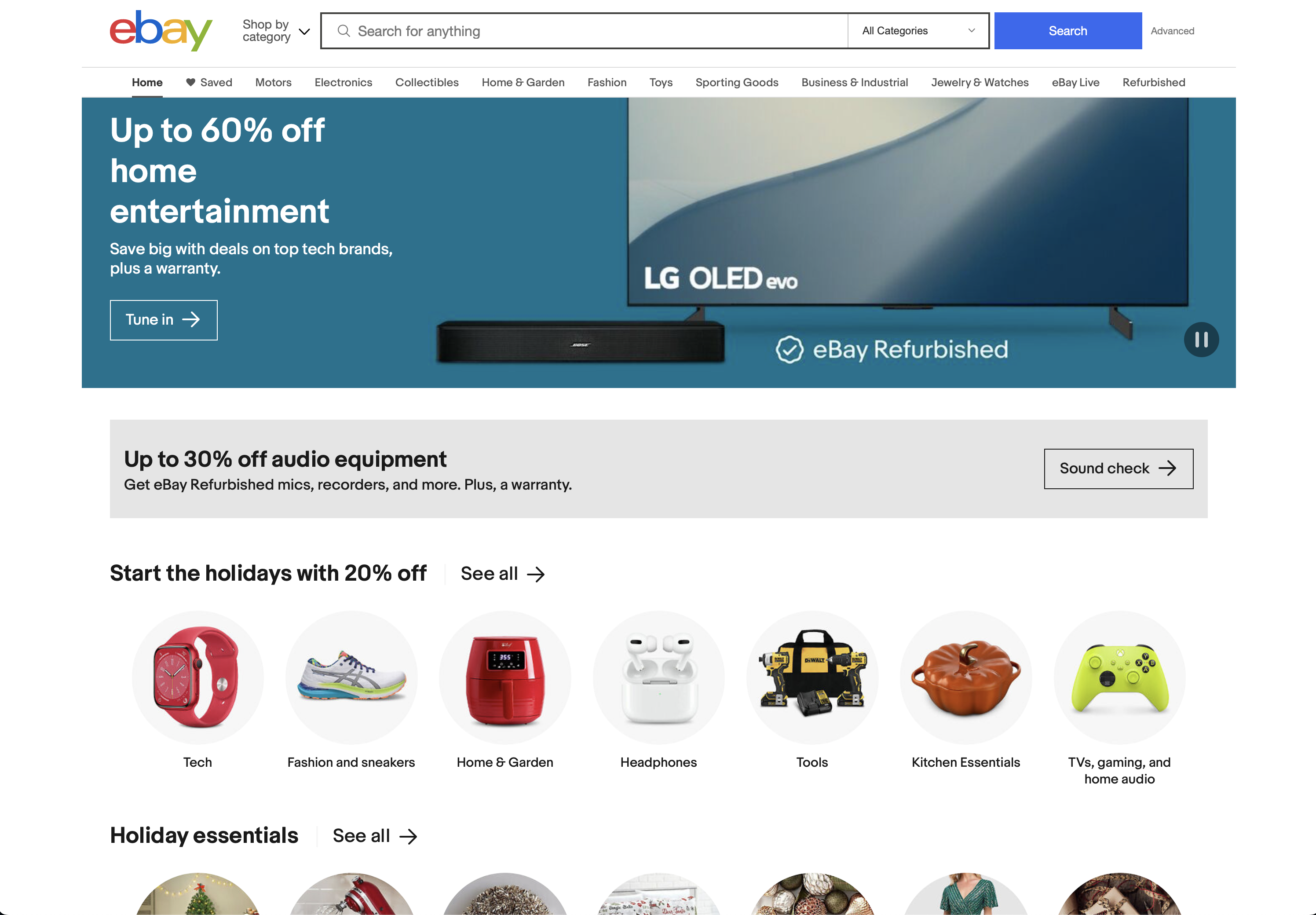
- Cluttered Layout: eBay’s homepage can appear cluttered with numerous links, categories, and product listings. It’s a far cry from the clean and spacious designs we often associate with modern websites.
- Overwhelming Information: The site often presents a vast amount of information all at once, which can be overwhelming for users who are accustomed to more minimalistic designs.
- Minimal Aesthetics: eBay’s design is decidedly utilitarian, prioritizing functionality over aesthetics. While this approach can make it less visually appealing, it serves the purpose of helping users find what they’re looking for quickly and efficiently.
- Color Palette: eBay’s use of primary colors and a somewhat dated color scheme can give it an old-fashioned appearance compared to contemporary websites that embrace more subtle and modern color palettes.
2. Google
Gasp!! Are we calling Google ugly? Well, yes, yes we are. We can be generous and say that it’s economical and simple if that makes you more comfortable. It is minimalist to the max. And like eBay, it uses those high-school art class prime colors. Google reigns supreme as the king of the search engines!
Google’s iconic homepage is another example of a design that’s often considered ‘ugly’ in terms of modern web design standards. It’s ‘ugly’ in the sense that it deliberately rejects modern design trends for a purpose-driven, minimalistic approach:
- Simplicity: Google’s homepage is arguably one of the simplest web designs you’ll encounter. It features a plain white background, a logo, a search bar, and a few buttons, which doesn’t align with the trend of visually rich and complex homepages.
- Lack of Visual Elements: While modern websites often incorporate large images, videos, and graphics, Google’s homepage focuses on a clean and text-centric interface. There are no distracting visual elements, which some people might find visually uninteresting or ‘ugly.’
- Absence of Features: Google’s homepage omits many features and design elements that other search engines might include, such as news snippets or personalized recommendations. The website focuses purely on the core search function, which can be seen as a rejection of contemporary feature-rich designs.
However, it’s essential to note that the simplicity and functionality of eBay and Google’s websites serve a specific purpose. eBay prioritizes product discovery and quick navigation for its users, while Google’s minimalistic approach focuses on providing a fast and efficient search experience. In both cases, the ‘ugly’ design is a deliberate choice to enhance usability and functionality. These examples illustrate that ‘ugly’ design can be highly effective when it aligns with a website’s core purpose and audience expectations.
3. Craigslist:
Holy text-only Batman! There’s nothing to this site…no logo…no banners…nothing. There barely is any color. Since its inception in 1995, the site only changed to add more cities and countries. It’s a real get-in and get-the-heck-out type of site.
Craigslist has maintained its simple, text-based design for many years, and this approach has garnered both admiration for its functionality and criticism for its perceived lack of modern aesthetics:
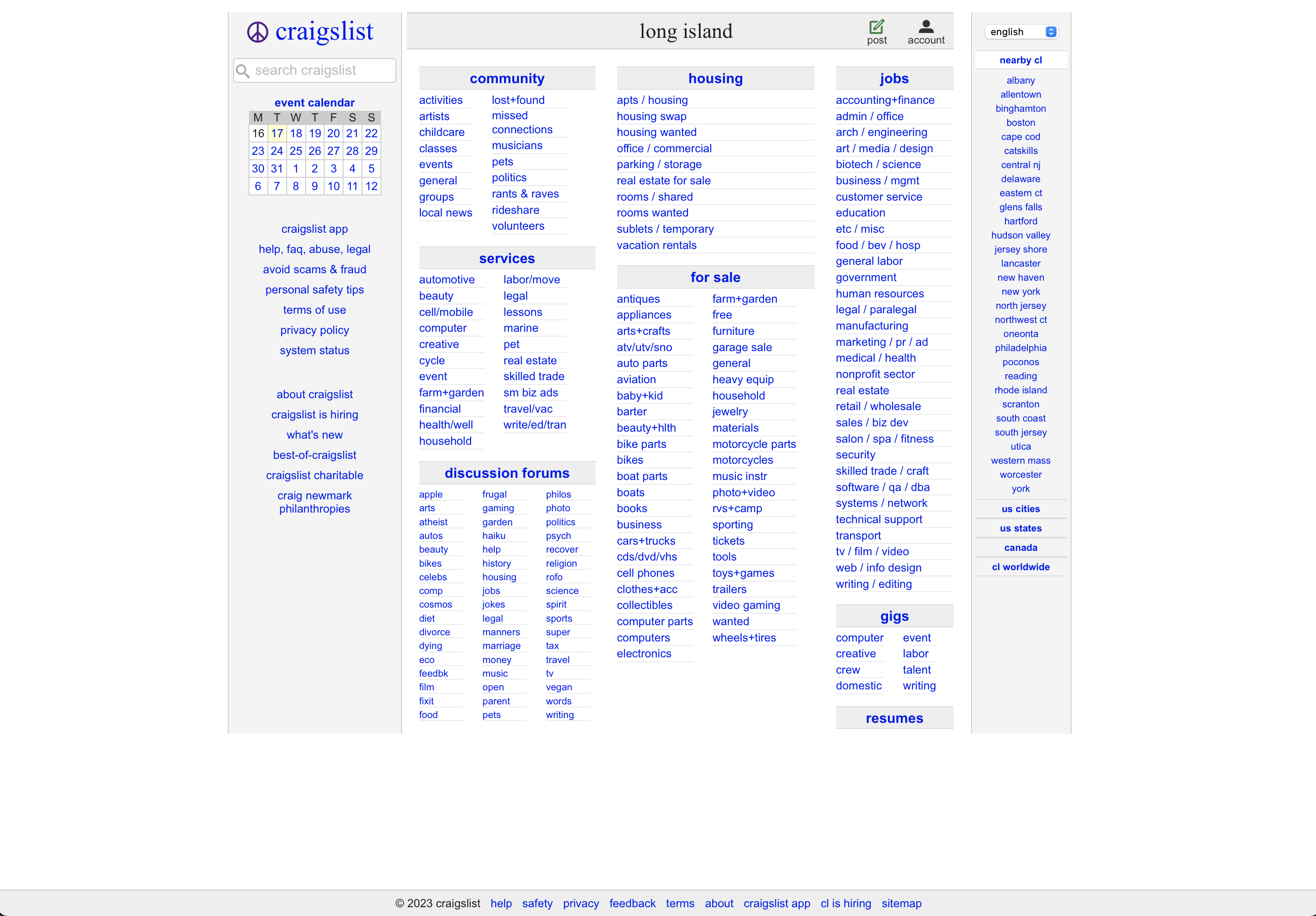
- Plain Text and Minimal Graphics: The Craigslist website relies heavily on plain text and minimal graphics. The lack of images, animations, and visual embellishments makes it appear visually plain and ‘ugly’ compared to websites with rich, multimedia content.
- Sparse Layout: The layout is minimal, with links to various categories and listings presented in a simple, list-style format. Modern design often emphasizes more sophisticated grid layouts and interactive components.
- No Mobile Optimization: Craigslist’s design has been slow to adapt to mobile devices. It often appears as a scaled-down desktop site on mobile, which can lead to a less-than-ideal user experience on smaller screens.
- Old-Fashioned Aesthetics: The design aesthetics on Craigslist have changed very little over the years, giving it an old-fashioned look in comparison to more contemporary and visually appealing websites.
- Limited Customization: While Craigslist allows users to post text-based listings, it provides minimal options for customization, which can make listings appear uniform and uninspiring.
4. Reddit:
Do you want to discuss Britney Spears, football, gaming, or ask AITA? Well, then Reddit is the place for you. All the best memes and deep cuts on the internet tend to originate on Reddit. The brilliance of it lies in the creation and promotion of content by the users themselves. It’s self-generating and its popularity has snowballed over the years.
Reddit is a hugely popular platform for discussions and content sharing, but its design has faced criticism for being visually cluttered and outdated:
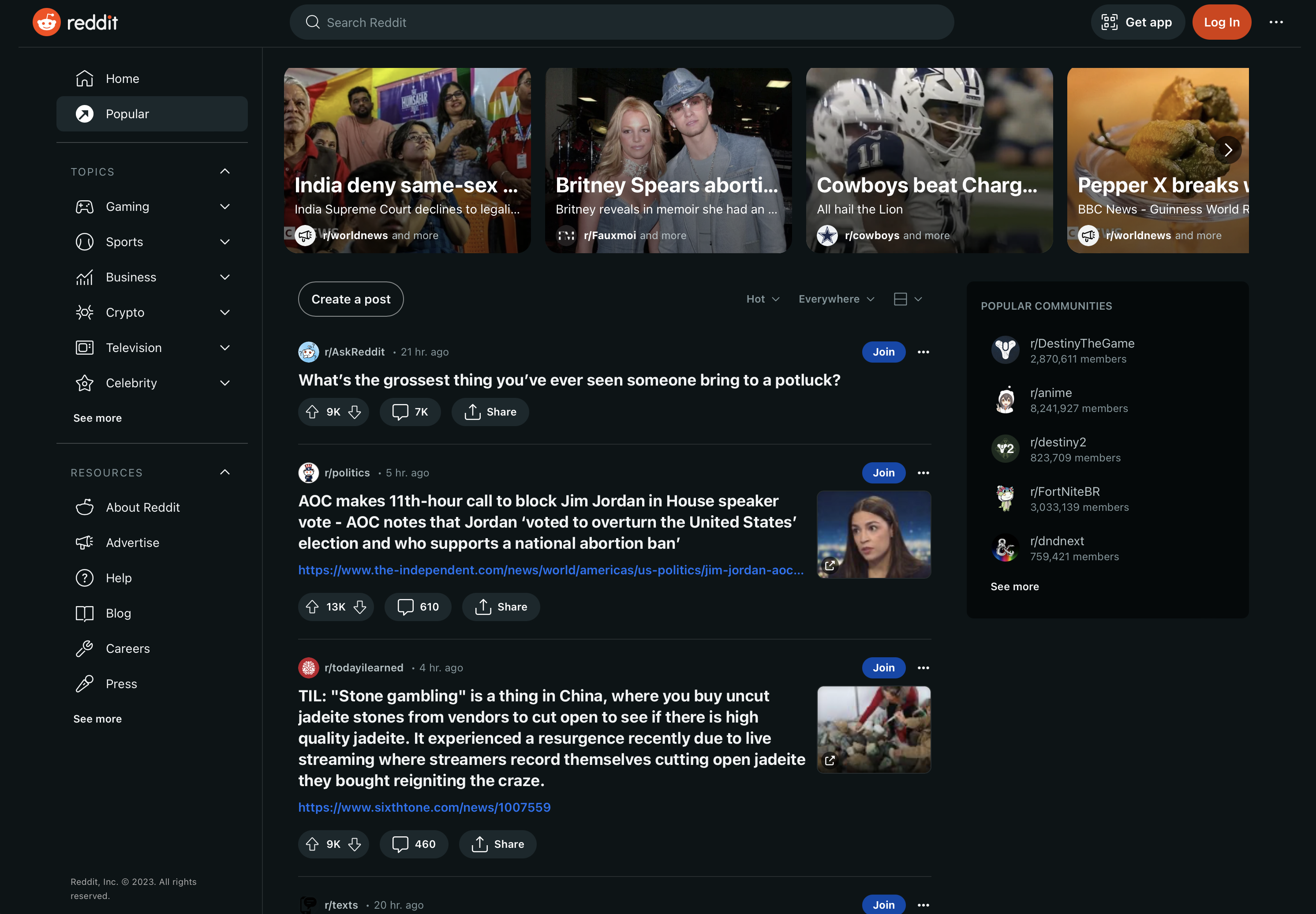
- Cluttered Interface: The front page of Reddit can be visually overwhelming, with numerous posts, comments, and discussions. This density can be off-putting for users who prefer cleaner and more organized layouts.
- Lack of Visual Polishing: Reddit’s design prioritizes functionality over aesthetics. It often lacks the visual polish seen on modern social media platforms, such as visually rich profiles, videos, and images.
- Minimal Color and Graphics: The color scheme is basic, and graphics are relatively limited, contributing to the perception of ‘ugliness’ in comparison to platforms that embrace more vibrant colors and graphic elements.
- Old-Fashioned Look: Reddit’s design has remained relatively consistent over the years, leading some to perceive it as outdated or unrefined compared to social media platforms that undergo frequent redesigns.
- Complex Navigation: Reddit’s navigation can be complex, with its numerous subreddits and threads. This can be confusing for newcomers or users accustomed to simpler navigation structures.
Both Craigslist and Reddit have opted for a no-frills, utilitarian approach to design, emphasizing content and functionality over aesthetics. While this choice might be viewed as ‘ugly’ by modern design standards, it aligns with their core purpose of providing straightforward, content-centric platforms for users. The perceived ‘ugliness’ in their designs is often a result of their commitment to simplicity and usability.
The Beauty of ‘Ugly’ in Modern Web Design
In the ever-evolving world of web design, the term ‘ugly’ is not one you’d expect to hear often. After all, the primary goal of web designers is to create visually appealing and functional websites, right? While this is true, there’s a fascinating shift happening in the design industry. We’re seeing the emergence of a trend that appreciates and embraces the unconventional and seemingly ‘ugly’ elements in web design.
At Logic Web Media, a leading web design company here on Long Island, we understand the importance of staying on the cutting edge of design trends. And yes, that includes understanding the beauty of ‘ugly’ in modern web design. Here, we’ll explore why ‘ugly’ can be a powerful design choice and how it can add a unique flair to your website.
1. Breaking the Mold
Modern web design has come a long way, and many websites today are sleek, minimalist, and visually appealing. However, in the quest for perfection, many websites have started to look indistinguishable from one another. ‘Ugly’ web design, in this context, helps break the mold. It challenges the status quo by defying conventional aesthetics and standing out.
2. Authenticity Over Perfection
In a world where filters and photo-editing apps dominate social media, the ‘ugly’ web design trend champions authenticity. It embraces the idea that not everything needs to be polished to be effective. Real-life imperfections can convey a sense of genuineness, which resonates with users on a deeper level.
3. Emotional Engagement
While polished and attractive websites have their place, ‘ugly’ web design can create a strong emotional connection. It often triggers curiosity, making users explore the site further to understand its unconventional charm. This curiosity can lead to higher user engagement and longer time spent on the site.
4. Nostalgia and Retro Appeal
Many ‘ugly’ websites draw inspiration from the early days of the internet. They pay homage to the nostalgia of the ’90s and the early 2000s, bringing a sense of retro appeal to their design. This can be a deliberate choice for websites targeting audiences with a penchant for nostalgia.
5. Focusing on Content
In ‘ugly’ web design, content often takes center stage. By stripping away excessive visual elements, these designs direct the user’s attention to what truly matters: the information and the message. This can be highly effective for websites with a strong emphasis on their content.
Embracing ‘Ugly’ in Web Design
Here at Logic Web Media, we’re not afraid to explore unconventional design choices. While we understand the importance of aesthetics and user experience, we also recognize that ‘ugly’ web design can be a powerful tool in the right context. We work closely with our clients to understand their goals and target audience to determine what type of web design is a suitable choice.
‘Ugly’ web design may not be for every website. It challenges the norm and offers a unique approach to capturing user attention and engagement. If you’re interested in experimenting with ‘ugly’ web design or any other design trend, don’t hesitate to reach out to us at Logic Web Media. We’re here to help you create a website that stands out and serves your business’s needs, even if it means embracing a bit of ‘ugly’ along the way.
Beauty, after all, is in the eye of the beholder, and sometimes, ‘ugly’ can be remarkably beautiful in its own way.