Project:
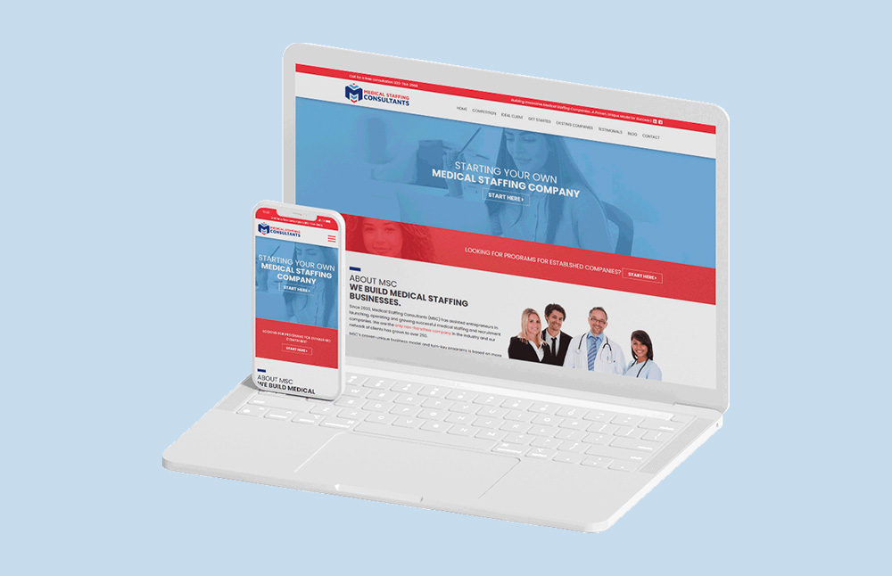
Medical Staffing Consultants


Medical Staffing Consultants has been a long-time client of Logic Web Media. We have assisted their business with small design and development projects. Eventually, the team at MSC realized that they needed a new website and updated branding for continued business growth.
Key Services
- UI/UX Design
- Full-Stack Development
- Digital Strategy
- SEO
- Data Migration
- 3rd Party Integrations
Ready To
Build Something Amazing?
Let's discuss your next project and explore how we can create something exceptional—whether you need a website design or an ecommerce powerhouse to supercharge sales.
Get Started Now